I begun trying to style my cause page for each media query. I have managed to complete each media query and this is how it looks like:

At desktop I have the two column layout, I added a nice little bottom border line in a brown colour underneath the title to keep a nice clean divider form the header to the body text.

At tablet I have the same layout, the only change is that I had to change the percentage width of the header so the line has a similar gap on the right to what it has on the left. I used a 94% width to do this.

I had to put a percentage margin on the images so there was a gap on each side of it so the image wasnt touching the sides. A margin in the bottom of the images so the text wasnt so close to the bottom of the image.
This is pretty much my first content page done apart from my homepage. Just two more pages to do now.

I have finished my Richter scale page, I have kept to the layouts I proposed to begin with, A two column layout, text on the left and media on the right.


On the tablet page I kept the same layout because it still looked clean and not clustered. I styled the css so everything was in line and even spacing around to look as clean as possible.
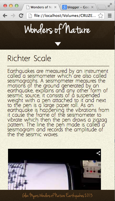
The mobile layout is a one column layout, everything styled central with nice gaps each side.


My outcome page was the hardest page to make, I had so many problems making it. I wanted the layout as seen as above consistently down the page with the other content but I kept getting positioning problems with the text and photos, they would go in line with the content above, the text kept making its way in the middle of the page. To overcome it I had to make separate divs for each column and picture and apply specific css so they would both sit next to each other on the same level. I had to trial and error with margin and width sizes. But got there in the end.

For the tablet layout, again I had to do exactly what I did in desktop by trial and error lots of values till everything was put in the right position it took ages but after a frustrating long time getting it in place it all got there in the end.

At mobile platform, this was relatively simple, putting everything in a one column layout and in a central clean looking layout.


My website is now finished, I really struggled to make it. I found it so diffcult to understand code and understand why errors were occuring, I was pretty much just guessing by changing random things I think could affect it. I had to open 'inspect element' so many times to find out which element was not working properly then going in to the css and changing loads of things. Overall, I found webcode not as great as the other projects, It was a more a major relief when i got what it want to do. I didn't really enjoy doing webcode due to how hard I found it. But next time, if we got this project again I think I would be 10 times more confident to make it then at the start. I understand some parts of code now, but still a bit edgey on it.
No comments:
Post a Comment