Saturday 25 January 2014

Changes made before production | Font

I am now going to use


As my animal font. It is much more bold and can illustrate the texture more efficiently. 

Feedback | Pitch

Preparing for pitch I thought I was organised and knew what what i was going to talk about. I had a strong understanding of the concept and direction I wanted to do. From this pitch went well, my presentation I was told was very well structured. I showed how I took key points from the brief and used them to design an idea to them. I thought I presented my concept well, everyone knew what I exactly wanted to do and what my idea is going to look like visually. The only negative thing I got back was that there was no mock up. Due to the time I didn't produce any mock up. I tried to make up for it by demonstrating what I wanted to make by pointing onto the background image and saying what it is going to look like.

Things to take on board

The only thing what was debatable was the font. Only due to its thickness, the inspiration poster I showed what I was going to follow had a much thicker font for the animal texture, the font I have chosen is quite fine. Considering this, I might pick the thicker font from my shortlist.

Sunday 19 January 2014

Research | Typography | Font

For my messages. I have created a short sentence of an adjective and the noun of the message. So two words respectively will be the words that have the animal fur texture applied to it. And the second part of the sentence which is the long description of text will be in a normal one colour font.

So my first part of the message has to be bold and fun looking font. Here is a shortlist I have gathered

First part of the message


I think these fonts are friendly, and will suit my theme. I can visualise the animal texture over the type and going well with these fonts. The one I will be using is Comfortaa.
I chose this one because I wasn't keen on how rounded the fabada font is it looked too fun for me. Fontastique was persuading me a lot but comfortaa tipped it because it is more conversational looking. Fontastique would be suited better for a one word thing. 

For the rest of the sentence. I don't know whether to use another font or just the same font but smaller obviously. Or have something really decorative and fancy looking. To give emphasis and more focus to the animal text. It also gives that feminine touch to it, which obviously reinforces my target audience of women so that is important.

But here are some fonts what I like and I could use.


I like all of these, I think all of them to a degree would fit my proposal. But the one i am going for is the 'Angelina' font. I have chose this because it is more a legitimate hand-written looking font compared to the other fonts. It looks very feminine and I visualised it with my other font I think they both match nicely.

Proposal | Key themes

After conducting various different types of research. I have a visualisation what I want my concept to be.

For my visual style key themes I want to portray are:


  • Animal
  • 3D
  • Dynamic
  • Creative
  • Visually exciting 
For my messages the key themes I want are:

  • Consistent 
  • Conversational
  • Aliteration 
  • Adjective
  • Friendly
  • Feminine
For my Font choice the key themes I want are:

  • Friendly
  • Calm
  • Modern
  • Fun
  • Alive

Research | Inspiration| Animal texture typography

Here I have found a tutorial how to make 3D animal texture typography.

http://psd.tutsplus.com/tutorials/text-effects-tutorials/animal-textured-typography/

Final outcome:


I quite like this. I wouldn't have the 3D as emphatic as in this image, but the same similar style.

Here is another image I have found which is the style I would like to portray.


It is a 3D look effect. Im not sure who the artist is, I think it was made from a student actually.

Saturday 18 January 2014

Research | Content | Animal theme?

Ive been thinking and I think this project is really hard to sprawl creative ideas. I had a thought of maybe having a visual theme of animals. Oasis does sell animal print fabrics. I want to have textured text so animal fur textures I think would suit the brand and can look visually nice. 

Animal textures I would consider would be:

Leopard print


Zebra print 


Snow leopard


Wolf


Snake


Tiger


Giraffe


Monday 13 January 2014

Research | Visual | Neil Webb


Neil Webb is an illustrator from London. I have looked at some of his artwork and i like his style.


He uses a mixture of texture and block colours. I really like this illustrate of meals at a table. There is only three colours. Purple, Orange and cream. He uses a wood grain texture which i like. It is a very square photo, a diagonal effect. I like the purple and orange together, it looks cosy and warm.


The snakes and ladders I think is a cool illustration. it looks 3D and wacky. vibrant blue and yellow star background with a plain black and white snakes and lasers on top. The snake is the only thing with texture.


Thumbnails of his designs on his website. His style is very bold, vibrant and unique which I like. It is a style i will consider when making mine.

Research | Technical | Existing messages

Considering these are the key words Oasis want messages for:
  • Time slot delivery. (We offer delivery slots at a time that suits you) 
  • We accept paypal in store (just download the app) 
  • Personal stylist in store (We offer personal shopping experiences in selected stores) 
  • Student discount 15% off all year round (With a valid NUS card) 
  • Cant find your size? We will track it down and deliver it for free 
  • Free wifi in store 
  • Gift cards 
  • My Oasis Card (apply for a loyalty card to make shopping even sweeter) 
  • We love social (follow us on Facebook, Twitter, Pinterest, Instagram & Google plus)
I think it would help to try find existing quotes from similar companies to get some inspiration.

Topshop

'Boot-ful' -  Pun for beautiful boots.
'Bringa little pout power from our lusture loving lip glosses' - Alliteration technique
'Insta-style' - Promoting their instagram

I could really find any other websites they give friendly messages, because it really isnt essential online. It is a more in store thing. It isn't important really the technical research for this project because it is more the visual aspect and the technique is only coming up with creative and imaginative messages which is a simple brain task. Writing techniques such as puns and alliterations are techniques though will help.


Research | Content | Oasis

URL: http://www.oasis-stores.com/?lng=en&ctry=GB&

Researching the company I am designing for, its important to get a nice feel of the ethos of Oasis.

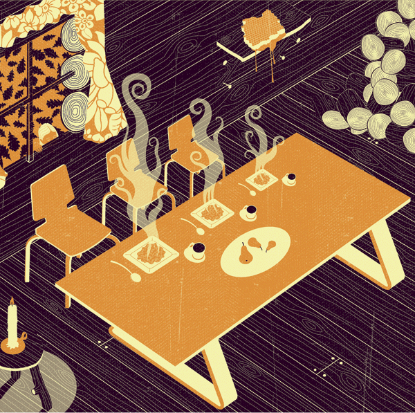
'Neil Webb' - illustrator

Looking at:

  • The range of clothes they sell
  • Textures/Patterns
  • The colours 
  • Visual style
  • Typeface
  • The website technical style
  • Any other things the brand offer


Oasis uses a vibrant pink as their main source of colour. On a plain white background. The brief already indicated the style of Oasis so I don't need to say they are classy and a stylish brand. But comparing to competitors on the market I would say Oasis is expensive therefore a higher class brand. Topshop is definitely one of the main competitors to use as a comparison and with Oasis, therefore Oasis are more expensive and more classy.

The types of woman that would shop here are definitely the more richer woman. But first I want to look at the types of clothes they sell which can give a symbol of a more defined target audience.


Here is a sniper of the types of dress Oasis sell. They use a lot of french styled breton stripes in there dresses and tops, also patterns such as flowers, butterflies and natural organic patterns. There style of dress is a lot of old fashioned which indicates older, mature women. Ages of 30-40's. But there are quite fun and bright tops, with birds on which would be for younger women of 20-30's. There target audience is definitely older than topshops too, they are more popular with teens. But Oasis offer student discount so that already shows older teens are targeted too with Oasis. But it seems much more mature than for students. But a lot of there clothes are definitely aimed at slim rich, women that keep in shape. The models that model the clothes look thin and in there mid 20's.


The bottom snippet shows there friendliness in there messaging. Its not just simple 'shop for christmas' they have there conversational messaging throughout the website.

Connotation and Denotation 


Oasis use connotation and denotation in there text a lot. For example this hashtag of 'meltintospring' they have the literal meaning of that its obviously entering into spring now but the melting into it is saying it was winter because we are going from cold metaphorically 'melting' into the next season. I think this could be a major element when generating ideas for messages they want. It is something ill definitely be taking into consideration.

Visually


On the website also there Sale text is illustrated visually rich. They have word 'sale' made out of organic textures such as leaves and flowers which is frozen inside an ice cube. The effect here of 'melting into spring' is illusrated with there typography. The visualisation of the ice symbolising winter melting gradually to reveal the leaves and flowers what represents spring, showing winter into spring. From this i can see what Oasis want. Using connotation and denotation and visually nice looking text.  

There is a section on the website called 'Loved by Hollie'. Which is Hollie from the the girl band the saturdays, clothes she likes from the website and her modelling them. This again symbolises the high class audience if a good looking celebrity is used to model the clothes and write her opinions on the clothes.

Brands current style

On their website I noticed they use a lot of short snappy slogans. Using the technique of an alliteration with the combination of an Adjective and the noun. For example:


This is a writing technique which I really like. And definitely will consider when designing my messages. I think using the brands current style is very important, I don't want to go away from Oasis. Consistency is a keyword when making my messages. 

Wednesday 8 January 2014

Chosen brief - Oasis

This brief focuses on typography as I have already mentioned. Oasis are a females clothing company. The brief says they want 'Creative messages that will stand out in our stores'.

Oasis is described as 'high street fashion brand, is renowned for innovative and stylish women’s fashion with a focus on feminine design detail, unique prints, vibrant colours and gorgeous dresses. Our DNA is clear: feminine, contemporary, confident, stylish and fun! Design has always been the heartbeat of what we do. We love print, we embrace colour, we love detail and above all else we are a brand that makes you smile.

Keywords from this are

- Stylish
- Unique
- Feminine 
- Vibrant colour
- Smile

''The challenge is to write a suite of service messages that will stand out in our stores. Your messages should have a non-seasonal focus and be-able to come across various channels - from in-store to online.'

'Stay true to our brand and appeal to the Oasis girl. You are free to bring your messages to life as you see fit. You may just wish to write them down in words, or to go to greater lengths to bring them to life visually using design and illustration. First and foremost we are looking for strong written messaging, but if you have ideas for how your messages can look visually, then we'd love to see them too.'

I have the option to write them down in words or use design and illustration. They want strong written messaging. I would rather go down the visual aspect.

The key words Oasis want to get across.

  • Time slot delivery. (We offer delivery slots at a time that suits you) 
  • We accept paypal in store (just download the app) 
  • Personal stylist in store (We offer personal shopping experiences in selected stores) 
  • Student discount 15% off all year round (With a valid NUS card) 
  • Cant find your size? We will track it down and deliver it for free 
  • Free wifi in store 
  • Gift cards 
  • My Oasis Card (apply for a loyalty card to make shopping even sweeter) 
  • We love social (follow us on Facebook, Twitter, Pinterest, Instagram & Google plus)
So there are 9 key words I have to design messages for.

'You should get creative with words and bring these messages to life! Think about the contexts in which the customer will come across them. How can we engage them? how can we surprise them? How can we delight them? Have fun with it!'

Key points

- Bringing the messages to life
- Engaging
- Surprising 
- Delighting

Target Audience

- Female
-Passion for fashion
- Stylish

Oasis brand style

- Chatty
- Playful
- Casual
- Friendly 
- Customer is best friend


YCN Brief(s) - Choose from a selection

For our third project of year we had to pick one of the briefs of the ycn website. As a class we analysed each brief and explained to the class a key summary of the brief. To be honest none of them really jumped out at me. The ones that interested me were the Bear one, DECC one and Oasis. But the Oasis one more appealed to me. Purely because it is a typography project, and I would like to do more on typography as we haven't focused too much on it over the course of last year and this year. So it would be new to do a project focusing on raw typography.