Showing posts with label YCN. Show all posts

Monday, 10 February 2014

Evaluation | Summary of this project

I thought the Oasis brief was pretty open as there wasn't much restriction in the way we could make a poster of any art style and in any direction but sticking to suiting it for a high end females clothing store. There is a nice amount of different potential approaches that could of been used for this brief. I am happy that I chose this brief. I haven't done much design work focusing on typography so I am glad I challenged something new, I could of picked something like the Bear brief which is basic graphic design of children's imagery which isn't anything new to me.

I very much enjoyed this project, it was fun creating the posters in photoshop as it a programme I enjoy designing in. I am pleased with what I have produced. I feel my designs answer the Oasis brief. Oasis wanted stated that:

'Stay true to our brand and appeal to the Oasis girl. You are free to bring your messages to life as you see fit. You may just wish to write them down in words, or to go to greater lengths to bring them to life visually using design and illustration. First and foremost we are looking for strong written messaging, but if you have ideas for how your messages can look visually, then we'd love to see them too.'

I focused my designs mainly on the phrase 'bring your messages to life' as I took the phrase literal and actually created typography to life metaphorically with real animals fur. I carefully analysed the brief and picked out keywords which I can focus on and design to match the keywords. The keywords I gathered from the brief were: Stylish, Unique, Feminine, Engaging, Surprising and Delighting. I feel my designs match every single one of these keywords. They are stylish in the way each fur text has its own unique attributes of texture, pattern and colour. The lighting around the background creates style. They are unique as Ive never seen a fur textured typography poster anywhere, each poster has its own animal theme. The animal theme is feminine; a lot of Oasis' clothes print is animal print. They are engaging as the alliteration technique of messaging gives a nice reading effect to the reader. The posters I think are nice to look at. I think they are very mud surprising due to the fact its developing static typography into alive textured typography in a related background environment. Delighting is portrayed by how visually rich the posters are, they are very much readable as well as being image based.

I also think the consistency in the posters makes the posters very much more strong and effective. Everything is very much positioned in the same places throughout. I have displayed Oasis' branding logo big, readable and bold which expresses the importance and dominance of labelling what the posters belong to. 

Personally I think the most effective part of the posters is how eye catching they are and how I have portrayed the focal point in being the animal text, the careful dark shading and glow lighting around the text makes them stand out and emphasise the main importance. 

The problems I encountered were making the posters readable, I had to play around with lighting and brushing around the text to make them stand out, considering colour and contrast. I manage to get through the obstacles by changing sharpness of lighting, opacity of glows, shadows and intensity of parts.

Overall I am happy with my work, also happy with how my PDF looks. We have been told how important it is that the PDF is designed well so it is carefully looked at.  I feel my PDF has a nice layout, big pictures to clearly see and that I have conveyed my concept well. I am content with everything in this project.

Development | Creating my Artwork

Creating the fur textured typography was easily the most time consuming process of making the posters. I used Photoshop to make the posters. To create the fur effect I had to make my own brush and brush around each individual letter. Precisely and delicately.

First off I had to type the text out in a big size (72pt) so it was zoomed in a lot.


I changed the properties of a default photoshop brush of a single grass shape into a scattered series of them so it looked like fur. I then had to go round each letter manually rotating the shape one every curve making sure the whole straight edge of each letter was covered up with the brush


After finishing brushing round the letters I had to add the selection inside the letters to the main selection. Using the lasso tool with the 'add to selection' button selected. I had to do this so when the image of the fur is pasted in it only goes in the selection inside the letters.


Next and final step is very simple. You get you picture of the animal fur, simply copy it then go back into photoshop and go to Edit>Paste Special>Paste into.


When thats done that's it. It will be successful if I brushed round every straight edge.


The poster is then made in a new Photoshop document. It is made up of a sourced image I had to find off google.

I dragged in my fur textured text, the Oasis logo and created the rest of the text. When all these main elements were in I just edited around them using brushes and gradients to edit the lighting, create shadows. Playing with opacities of the colours black and white to do this.


Saturday, 8 February 2014

PDF | Planning

In my PDF I propose to talk about my idea and concept. Why I chose to do it (research and idea development), what it brings as a design (as a sucess), how it answers the brief and how Oasis can benefit from it. I will include how I made my posters with screenshots of in -development; demonstrating how I created the fur texture on the typography. The PDF has to be 8 pages long(A3) and I will be using either illustrator or inDesign to make it.

Friday, 7 February 2014

More Development | Changing the Zebra poster

I had look at all my posters and thought the Zebra text was quite hard to read with the blurry backlight. So made the light a bit more sharp to give a more outline around the text so it is easier to read. I didn't want it too sharp obviously cause the text still needs to look textured with fur around it so I made the change. Here is the before and after.


I think it is much easier to read with the sharper light glow.  

Final artwork | (For now)

I have spent good time after crit finessing my artwork. I have 4 finished posters here they are in order of production.


I made most of the changes asked at crit. Changing all text to white, which I think does work better, it keeps that a consistent theme. I removed the '!' from the word 'Woo' in the wolf texture poster. I made sure that the Oasis logo is presented in the same position and size in every poster. I made sure the text in the bottom left is in the same position and size too. 

The first two posters (tiger and leopard) are a smaller size than the other two. I done two small posters and two big posters because Oasis said they would want designs for web as well as in store. So I gave the variation of two different sized posters.

I have played a lot on the dark shading around the text to bring it out as much as possible. Also each fur text has a different shadow to it depending on the background environment and lighting angle in the photo to give a more unique dynamic element in each poster.  Ive made the posters more darker so the focal points are more emphasised (fur text and brand logo).

Now to begin with making the PDF...

Wednesday, 5 February 2014

Crit | feedback

Crit went well. I was satisfied with the feedback, a lot of people liked my posters. Comments were they are nicely designed. The improvements I could make were very little which I was very happy with. This is a short list of feedback I could make to improve my designs.
  • Lose the '!' in Woo!
  • Spacing between the letters in wifi
  • Change the colour of the text in the bottom to white?
  • Pull the Oasis logo more away from the edge
  • Darker light glow behind 'wifi'
So not too much to do, just these small changes, create another poster and create the PDF is all whats left.

Monday, 3 February 2014

In development feedback (Kate)

I had created two posters so far. One for the Paypal message and another for the delivery message. I asked Kate, my lecturer to have a look at them to get some feedback midway through development which was really useful. The two posters I showed looked like this.


We had a long discussion of how things can be changed etc and this is a list of things we came up with.

Leopard text
- Oasis logo, text isn't readable > Make bigger, reposition
- Sentence > Get rid of 'will' put a full stop after want so 'For free' is its own line. Makes is snappier and more important. Reposition underneath the leopard text to keep consistent theme of positioning.
- I felt personally the leopard text needs to be brought out more, stand out so it is the main focus. So I wanted to add dark gradients around it and have a subtle glow to light the text up a little.
- Change the colour of the type to a more of a match to the leopard text

Tiger text
- Same as the leopard text. Re position the logo, make it bigger, readable, consistent.
- I personally again wanted to put dark lighting around the text to make it stand out more.
- Add the worse 'in store' after 'Pay' to make the sentence longer and more easier to understand what the meaning is.

After finessing the little edits these are what the two posters look like now.


For me they look so much better just from simple changes. The logo of Oasis stands out so much and is easily readable which is majorly important in a poster. Its bossing the brand so people will clearly recognise the brand. I made it white so it contrasts a lot better on the dark background. Originally it was black with a subtle light glow around it but I played around and made it white and thought this is the solution. The two fur textured text stand out much more. The dark lighting around it enables the human eye not to focus on any background context, just purely the typography which is my aim. I have kept a consistency in the positioning and sizing of the logo, colour and size. Oasis stated they wanted their posters to have a consistent style, I think I have achieved this.

After making these two Kate said I wouldn't have to make all 8 messages as proposed. As the point of the yen brief is to design your concept, it would be better for me to make 4 more finessed posters rather than make all 8. You can clearly see my concept in just a few of the posters. This is good news anyway cause I would of had really struggled for time to make all 8, plus the PDF. So only two more to go.

Saturday, 25 January 2014

Changes made before production | Font

I am now going to use


As my animal font. It is much more bold and can illustrate the texture more efficiently. 

Feedback | Pitch

Preparing for pitch I thought I was organised and knew what what i was going to talk about. I had a strong understanding of the concept and direction I wanted to do. From this pitch went well, my presentation I was told was very well structured. I showed how I took key points from the brief and used them to design an idea to them. I thought I presented my concept well, everyone knew what I exactly wanted to do and what my idea is going to look like visually. The only negative thing I got back was that there was no mock up. Due to the time I didn't produce any mock up. I tried to make up for it by demonstrating what I wanted to make by pointing onto the background image and saying what it is going to look like.

Things to take on board

The only thing what was debatable was the font. Only due to its thickness, the inspiration poster I showed what I was going to follow had a much thicker font for the animal texture, the font I have chosen is quite fine. Considering this, I might pick the thicker font from my shortlist.

Sunday, 19 January 2014

Research | Typography | Font

For my messages. I have created a short sentence of an adjective and the noun of the message. So two words respectively will be the words that have the animal fur texture applied to it. And the second part of the sentence which is the long description of text will be in a normal one colour font.

So my first part of the message has to be bold and fun looking font. Here is a shortlist I have gathered

First part of the message


I think these fonts are friendly, and will suit my theme. I can visualise the animal texture over the type and going well with these fonts. The one I will be using is Comfortaa.
I chose this one because I wasn't keen on how rounded the fabada font is it looked too fun for me. Fontastique was persuading me a lot but comfortaa tipped it because it is more conversational looking. Fontastique would be suited better for a one word thing. 

For the rest of the sentence. I don't know whether to use another font or just the same font but smaller obviously. Or have something really decorative and fancy looking. To give emphasis and more focus to the animal text. It also gives that feminine touch to it, which obviously reinforces my target audience of women so that is important.

But here are some fonts what I like and I could use.


I like all of these, I think all of them to a degree would fit my proposal. But the one i am going for is the 'Angelina' font. I have chose this because it is more a legitimate hand-written looking font compared to the other fonts. It looks very feminine and I visualised it with my other font I think they both match nicely.

Proposal | Key themes

After conducting various different types of research. I have a visualisation what I want my concept to be.

For my visual style key themes I want to portray are:


  • Animal
  • 3D
  • Dynamic
  • Creative
  • Visually exciting 
For my messages the key themes I want are:

  • Consistent 
  • Conversational
  • Aliteration 
  • Adjective
  • Friendly
  • Feminine
For my Font choice the key themes I want are:

  • Friendly
  • Calm
  • Modern
  • Fun
  • Alive

Research | Inspiration| Animal texture typography

Here I have found a tutorial how to make 3D animal texture typography.

http://psd.tutsplus.com/tutorials/text-effects-tutorials/animal-textured-typography/

Final outcome:


I quite like this. I wouldn't have the 3D as emphatic as in this image, but the same similar style.

Here is another image I have found which is the style I would like to portray.


It is a 3D look effect. Im not sure who the artist is, I think it was made from a student actually.

Saturday, 18 January 2014

Research | Content | Animal theme?

Ive been thinking and I think this project is really hard to sprawl creative ideas. I had a thought of maybe having a visual theme of animals. Oasis does sell animal print fabrics. I want to have textured text so animal fur textures I think would suit the brand and can look visually nice. 

Animal textures I would consider would be:

Leopard print


Zebra print 


Snow leopard


Wolf


Snake


Tiger


Giraffe


Monday, 13 January 2014

Research | Visual | Neil Webb


Neil Webb is an illustrator from London. I have looked at some of his artwork and i like his style.


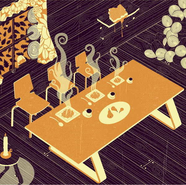
He uses a mixture of texture and block colours. I really like this illustrate of meals at a table. There is only three colours. Purple, Orange and cream. He uses a wood grain texture which i like. It is a very square photo, a diagonal effect. I like the purple and orange together, it looks cosy and warm.


The snakes and ladders I think is a cool illustration. it looks 3D and wacky. vibrant blue and yellow star background with a plain black and white snakes and lasers on top. The snake is the only thing with texture.


Thumbnails of his designs on his website. His style is very bold, vibrant and unique which I like. It is a style i will consider when making mine.

Research | Technical | Existing messages

Considering these are the key words Oasis want messages for:
  • Time slot delivery. (We offer delivery slots at a time that suits you) 
  • We accept paypal in store (just download the app) 
  • Personal stylist in store (We offer personal shopping experiences in selected stores) 
  • Student discount 15% off all year round (With a valid NUS card) 
  • Cant find your size? We will track it down and deliver it for free 
  • Free wifi in store 
  • Gift cards 
  • My Oasis Card (apply for a loyalty card to make shopping even sweeter) 
  • We love social (follow us on Facebook, Twitter, Pinterest, Instagram & Google plus)
I think it would help to try find existing quotes from similar companies to get some inspiration.

Topshop

'Boot-ful' -  Pun for beautiful boots.
'Bringa little pout power from our lusture loving lip glosses' - Alliteration technique
'Insta-style' - Promoting their instagram

I could really find any other websites they give friendly messages, because it really isnt essential online. It is a more in store thing. It isn't important really the technical research for this project because it is more the visual aspect and the technique is only coming up with creative and imaginative messages which is a simple brain task. Writing techniques such as puns and alliterations are techniques though will help.


Research | Content | Oasis

URL: http://www.oasis-stores.com/?lng=en&ctry=GB&

Researching the company I am designing for, its important to get a nice feel of the ethos of Oasis.

'Neil Webb' - illustrator

Looking at:

  • The range of clothes they sell
  • Textures/Patterns
  • The colours 
  • Visual style
  • Typeface
  • The website technical style
  • Any other things the brand offer


Oasis uses a vibrant pink as their main source of colour. On a plain white background. The brief already indicated the style of Oasis so I don't need to say they are classy and a stylish brand. But comparing to competitors on the market I would say Oasis is expensive therefore a higher class brand. Topshop is definitely one of the main competitors to use as a comparison and with Oasis, therefore Oasis are more expensive and more classy.

The types of woman that would shop here are definitely the more richer woman. But first I want to look at the types of clothes they sell which can give a symbol of a more defined target audience.


Here is a sniper of the types of dress Oasis sell. They use a lot of french styled breton stripes in there dresses and tops, also patterns such as flowers, butterflies and natural organic patterns. There style of dress is a lot of old fashioned which indicates older, mature women. Ages of 30-40's. But there are quite fun and bright tops, with birds on which would be for younger women of 20-30's. There target audience is definitely older than topshops too, they are more popular with teens. But Oasis offer student discount so that already shows older teens are targeted too with Oasis. But it seems much more mature than for students. But a lot of there clothes are definitely aimed at slim rich, women that keep in shape. The models that model the clothes look thin and in there mid 20's.


The bottom snippet shows there friendliness in there messaging. Its not just simple 'shop for christmas' they have there conversational messaging throughout the website.

Connotation and Denotation 


Oasis use connotation and denotation in there text a lot. For example this hashtag of 'meltintospring' they have the literal meaning of that its obviously entering into spring now but the melting into it is saying it was winter because we are going from cold metaphorically 'melting' into the next season. I think this could be a major element when generating ideas for messages they want. It is something ill definitely be taking into consideration.

Visually


On the website also there Sale text is illustrated visually rich. They have word 'sale' made out of organic textures such as leaves and flowers which is frozen inside an ice cube. The effect here of 'melting into spring' is illusrated with there typography. The visualisation of the ice symbolising winter melting gradually to reveal the leaves and flowers what represents spring, showing winter into spring. From this i can see what Oasis want. Using connotation and denotation and visually nice looking text.  

There is a section on the website called 'Loved by Hollie'. Which is Hollie from the the girl band the saturdays, clothes she likes from the website and her modelling them. This again symbolises the high class audience if a good looking celebrity is used to model the clothes and write her opinions on the clothes.

Brands current style

On their website I noticed they use a lot of short snappy slogans. Using the technique of an alliteration with the combination of an Adjective and the noun. For example:


This is a writing technique which I really like. And definitely will consider when designing my messages. I think using the brands current style is very important, I don't want to go away from Oasis. Consistency is a keyword when making my messages.