After pitching my proposal to the class, I felt it went very well and I got a lot of positive feedback from everyone.
I pitched to Kate and she said I had put a lot of thought into my proposal, and said I knew exactly what I wanted to make. Which is important and true. My inspirations where vital in my idea, without them it would of been much harder to come up with an idea. I have a strong visualisation of what I want my website to look like exactly in my head; i'm pretty confident my pitch gave a strong visualisation to the audience of how I wanted my website to look too. I carefully went through my visual elements in my pitch such as: wireframes, backgrounds. textures, navigation etc. I'm happy with what I pitched and I feel I can build my website now with a good knowledge of what I want to build. It will be tough to make as I have never done this before and I am finding web code tough to learn through the tutorial lessons.
Tuesday, 26 March 2013
Monday, 25 March 2013
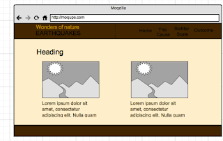
Wireframes - website
Homepage - Desktop/Tablet Landscape

This will be a image slider which you can navigate between the images, each image will be a link to 'The cause', 'Richter Scale' & 'Outcome'
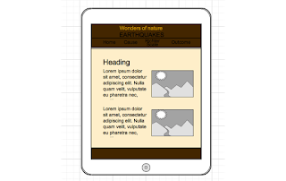
Homepage - Tablet portrait

The change here is that the nav drops below the header.


For mobile Im having text above the image like this.
The outcome - Desktop & tablet landscape
My layout for the outcome page will be divided into two columns, into sections with an image and text below it displaying information on historic earthquakes of the twentieth outcome. It will show information such as number of people killed, measurement on the richter scale, date, location and number of casualties.
The outcome - Tablet portrait
My layout here will be different to the image above, instead of having text on the left and image on the right im going to either have the two column layout the same as desktop and tablet landscape unless it looks too cramped; again i will have to test it when im actually making it. If it is too cramped then i will make it into a one column layout with text below image again.
The outcome - Mobile
For mobile it will be one column layout, text above image again.

This will be a image slider which you can navigate between the images, each image will be a link to 'The cause', 'Richter Scale' & 'Outcome'
Homepage - Tablet portrait

The change here is that the nav drops below the header.
Homepage - Mobile

When it gets to mobile I shall have a drop down navigation represented by by a little arrow graphic.
The Cause & Richter Scale - Desktop/tablet landscape

My layout for these two tabs will be two column lay out. With text on the left and images on the right.
The cause is about how earthquakes are caused. It will be demonstrated by images of diagrams of the earth and its inside elements illustrating how it is done, with some text to support each diagram.
The Richter Scale page tells you how it is recorded, with an images and maybe video if i can get it in to support the text.
The cause & Richter Scale - Tablet portrait

My tablet portait lay out will be like this, text on top image on bottom. But this is not a concrete decision, it may be possible to have the same lay out as tablet landscape, it will depend how cramped it looks when ive actually made the page. So potentially this layout is a maybe.
The cause & Richter Scale - Mobile

For mobile Im having text above the image like this.
The outcome - Desktop & tablet landscape

My layout for the outcome page will be divided into two columns, into sections with an image and text below it displaying information on historic earthquakes of the twentieth outcome. It will show information such as number of people killed, measurement on the richter scale, date, location and number of casualties.
The outcome - Tablet portrait

My layout here will be different to the image above, instead of having text on the left and image on the right im going to either have the two column layout the same as desktop and tablet landscape unless it looks too cramped; again i will have to test it when im actually making it. If it is too cramped then i will make it into a one column layout with text below image again.
The outcome - Mobile

For mobile it will be one column layout, text above image again.
Wire frames - iBook
For my iBook I want the first chapter which is the cause of earthquakes to be pages of text and animation in a simple 2 column layout.

When the play button is clicked the animation will play illustrating the cause of an earthquake.
For chapter 2:

This was my original idea to have video explaining how seismographs work but i developed a better idea to introduce better interactivity by having buttons from 1 - 10 across the page and when you click on one of those buttons their will be an image what shakes to the according value on the richter scale so when 1 is clicked for example the image wont shake a lot on the other hand when a high number like 9 is clicked the image will shake loads, the higher the number the more the image shakes. I will be creating this using the magic move feature in keynote then simple importing it directly from keynote into ibooks author.
For chapter 3:

This wireframe has now been changed due to my idea development, this was originally going to be an image slider of historic earthquakes with basic facts and figures. Now it is going to be a massive image of the world map with little pin points which you click on on the world map which will symbolise the location of historic earthquakes, when the point is clicked a image will pop up with the facts and figures underneath on that earthquake.
Sunday, 24 March 2013
Style tile
What is a style tile?
'In its simplest form, a Style Tile is a single page collection of common elements including colors, typography, textures, patterns and design features. Where an interior designer may present their client with a mood board comprising paint chips, fabrics and magazine clippings, the progressive web designer can present their stakeholders with a set of Style Tiles.'
'The important thing to remember about Style Tiles is that they are not a literal representation of how the site will look; instead, they help define the mood, tone and ‘feeling’ of a site based on what you’ve learnt from the client in your initial kickoff meetings.'
source: http://webdesign.tutsplus.com/tutorials/workflow-tutorials/style-tiles-an-alternative-to-full-design-comps/
This is what my style tile looks like:

This is what my style tile looks like:

Friday, 22 March 2013
Fonts
My chosen font is important that it fits with my theme/visual style I have. I want two different fonts. One for the title 'Wonders of Nature' and one for just general body and title font.
My typeface has to fit with my visual style which I have now clarified as quite formal, professional and elegant. The spoon graphics website which I have refereed quite a lot used a really simple typeface for the body and a more exciting type face for the title, this is what I will be doing with my fonts. So my wonders of nature title will be a bit more fancy and exciting whereas the body will be a more formal and professional font also sans serif so it looks modern and fits the professional theme. Here are some typefaces I have looked up which are potentials for my website.
For the heading title 'Wonders of nature'


This is the style I want for my title, fancy and like hand written. I think when you visualise the words 'Wonders of nature' it is calling out for a fancy font which emphasises the powerful meaning of the text. Having just a simple and boring sans serif font for it wouldn't make as good as meaningful impact as a more emphasised dynamic font would. Looking at these, the one I like most is probably 'Daniel' I like how big the capital is of the font compared to the lower case, its a nice emphasis which I want. Its a nice weight, as its not too bold and not too fine.
My body text now I want to look formal and professional, but the font can't be too fine as that is too much. My theme has little ridged edges to separate some block levels, so that means I cant be too professional as I think these two themes wont suit. So I want a weight on the font fine but not too fine, I think the contrast of the professionalism on the earthy colours is a really nice match and looks elegant. So here are some potential fonts I have found.


Having a look at these the one I like most is the 'Aaargh' typeface. I decided on this one because I it isnt too fine compared to like the quicksand font. Its about the same width as the daniel one which i used for the header maybe a tad smaller which I think is a nice fit. I like how smooth it is, its not too formal so I think it will go with my earthy/professional theme nicely. My little ridge edges I think will look nice with it. I didnt want a bold formal font because I want it to like have a little contrast to the ridged edges and from researching the websites which have the same visual style as me they used similar fonts and it just worked together really well.
My typeface has to fit with my visual style which I have now clarified as quite formal, professional and elegant. The spoon graphics website which I have refereed quite a lot used a really simple typeface for the body and a more exciting type face for the title, this is what I will be doing with my fonts. So my wonders of nature title will be a bit more fancy and exciting whereas the body will be a more formal and professional font also sans serif so it looks modern and fits the professional theme. Here are some typefaces I have looked up which are potentials for my website.
For the heading title 'Wonders of nature'

This is the style I want for my title, fancy and like hand written. I think when you visualise the words 'Wonders of nature' it is calling out for a fancy font which emphasises the powerful meaning of the text. Having just a simple and boring sans serif font for it wouldn't make as good as meaningful impact as a more emphasised dynamic font would. Looking at these, the one I like most is probably 'Daniel' I like how big the capital is of the font compared to the lower case, its a nice emphasis which I want. Its a nice weight, as its not too bold and not too fine.
My body text now I want to look formal and professional, but the font can't be too fine as that is too much. My theme has little ridged edges to separate some block levels, so that means I cant be too professional as I think these two themes wont suit. So I want a weight on the font fine but not too fine, I think the contrast of the professionalism on the earthy colours is a really nice match and looks elegant. So here are some potential fonts I have found.

Having a look at these the one I like most is the 'Aaargh' typeface. I decided on this one because I it isnt too fine compared to like the quicksand font. Its about the same width as the daniel one which i used for the header maybe a tad smaller which I think is a nice fit. I like how smooth it is, its not too formal so I think it will go with my earthy/professional theme nicely. My little ridge edges I think will look nice with it. I didnt want a bold formal font because I want it to like have a little contrast to the ridged edges and from researching the websites which have the same visual style as me they used similar fonts and it just worked together really well.
Idea change - layout + Visual style progression.
My initial idea I have been going along with the whole time is having a black background with the brown wrapper container on top. I have changed this idea into having just one brown background with the container elements having an invisible background. I think this avoids the risk of having the contrast between black and brown too overpowering. I also think it gives a more professional look and with my visual style as I have described what my style is going to look visually by colours and textures. The technical visual style I want is I want it to look quite formal and professional with the earthy theme. This means my font face im going to use is going to look slick, and formal.


You could kind of say by website is based from both of these. I have already said about how these are inspirations, but this post is the clarification that I'm using visual style elements from both of these and my visual style is pretty much is a combination of both of these.
Production Schedule
Key
Green - Done
Amber - In process
Week 1 1st March
Green - Done
Amber - In process
Week 1 1st March

Week 2 8th March

Week 3 15th March


Tuesday, 19 March 2013
Colour pallet
The colours my whole website and iBook is going to be styled around are from these colour pallets:


The background colours will be browns, but the main importance is that the texture these browns will be. I have mentioned clearly its going to be an old rough paper style. This will be applied for the header background, navigation, content background and footer. The web page background will be black and with the same texture to keep the consistency and convey my visual style. Here is an image of what im talking about visually.

So you can imagine this as the background with a similar (not the same) texture light brown wrapper on top with ridged edges. This black background would have to be recoloured in photoshop as I would have it more darker so it stood out more and contrasted better to the wrapper.
Textures for the brown wrapper would be similar to this:

The header and navbar will be similar to the picture below but not as dark, it would be a bit more darker than the light brown wrapper because the black text on top has to be readable still and it cant contrast too much to the light brown wrapper or it will just look a bit too overpowering.

Monday, 18 March 2013
My visual style
The brief states the website must be 'informative, visually exciting and engaging for the user through content and imaginative use of interactivity.'
My design is going to try and focus answering this specific sentence.
My visual style I have had a good think about and I have decided i'm focusing on a theme of 'Natural' you could say my design is based on this keyword.
So to start with my boxes and the website itself; every edge is going to be ridged to give that scratchy look which I think goes well with earthquakes as they them self create that sort of ridged effect when they make impact to the earth.
For my background I have had a thought about using an image but I really don't think i will be using one. Im more dragged to the idea of sticking to textures/patterns as the background. I really like the faded light brown background the truetea website uses. I want something very similar to this.

But I also have other ideas for colours so i'm quite sure yet what the background of the actual website is going to be compared to the wrapper background. Im visualising in my head to have the background a pastel effect like black with the wrapper being a pastel faded brown like what is used in the website above. I would have the header a darker brown like the footer used in the website above using a brown very similar to the second to bottom brown. Have all text on the page black which I think will contrast well to the light faded brown.
I also want to use this brown shine effect on the brown background with a grain effect, I think it looks really nice and would suit my visual style. It will add a bit more excitement and dynamism to the look.

From that indie dude website, this use the effect which gave me inspiration to put it in mine, I think it just looks really nice, it goes well with my earthy/natural/grainy theme. I want to use this behind the title of 'Wonders of Nature - Earthquakes' Header then in the iBook have it coming from the bottom right hand corner on each background of every section.
For my navigation I drew up on sketches of what I want the roll over to look like. Here I have found inspiration for m choice of having a transparent box come behind the text when the mouse is hovered over it.

The background texture for this header is ironically very similar to what I'm having as well, this is the visual style im trying to replicate. I want to use the same idea of when your on a page the tab on the nav is highlighted to whatever page your on, with the box touching the bottom of the navigation just like here in this one.
My design is going to try and focus answering this specific sentence.
My visual style I have had a good think about and I have decided i'm focusing on a theme of 'Natural' you could say my design is based on this keyword.
So to start with my boxes and the website itself; every edge is going to be ridged to give that scratchy look which I think goes well with earthquakes as they them self create that sort of ridged effect when they make impact to the earth.
For my background I have had a thought about using an image but I really don't think i will be using one. Im more dragged to the idea of sticking to textures/patterns as the background. I really like the faded light brown background the truetea website uses. I want something very similar to this.

But I also have other ideas for colours so i'm quite sure yet what the background of the actual website is going to be compared to the wrapper background. Im visualising in my head to have the background a pastel effect like black with the wrapper being a pastel faded brown like what is used in the website above. I would have the header a darker brown like the footer used in the website above using a brown very similar to the second to bottom brown. Have all text on the page black which I think will contrast well to the light faded brown.
I also want to use this brown shine effect on the brown background with a grain effect, I think it looks really nice and would suit my visual style. It will add a bit more excitement and dynamism to the look.

From that indie dude website, this use the effect which gave me inspiration to put it in mine, I think it just looks really nice, it goes well with my earthy/natural/grainy theme. I want to use this behind the title of 'Wonders of Nature - Earthquakes' Header then in the iBook have it coming from the bottom right hand corner on each background of every section.
For my navigation I drew up on sketches of what I want the roll over to look like. Here I have found inspiration for m choice of having a transparent box come behind the text when the mouse is hovered over it.
The background texture for this header is ironically very similar to what I'm having as well, this is the visual style im trying to replicate. I want to use the same idea of when your on a page the tab on the nav is highlighted to whatever page your on, with the box touching the bottom of the navigation just like here in this one.
Technical research
As the brief states this is a responsive website I need to conduct some research into some existing responsive websites to get an idea of how I can make my website responsive. This means analysing the 'break points' when you scale down the website. I found a website that illustrates this well breaking down to tablet and mobile phone platform:


When it scales down to mobile platform everything changes to just the one column. I have already planned in my sketchbook how i'm approaching my responsive elements so looking lots into this isn't really necessary, i'm content with my wire framing for layouts. I need to figure out what my visual style is going to be now and start looking at fonts and colour schemes.


Here is the desktop platform of this website, heres what happens when the website is slowly scaled down to the breakpoint of the tablet platform.


The whole page changes and adapts to the new screen size which is for a tablet. The navigation changes to a drop down menu and columns of content changes from 3 to 2.


When it scales down to mobile platform everything changes to just the one column. I have already planned in my sketchbook how i'm approaching my responsive elements so looking lots into this isn't really necessary, i'm content with my wire framing for layouts. I need to figure out what my visual style is going to be now and start looking at fonts and colour schemes.
Subscribe to:
Comments (Atom)