My problem is I have sorted my navigation into just 3 sections. So i need to research what is the best way I can sort the navigation of this into a nice unique responsive visual style.
I conducted some research into some existing websites and archived the ones I like the style of and what is inspiration for the style of my website.
This visual style from Adobes websites I really liked. It looks clean and professional. I like the crisp type face they use but more importantly what struck me with this website is the sliding images navigation on the home page. I think its a nice interactive way to navigate and I thought it would suit well in my website by having the 3 sections of navigation with the little circles underneath to click on to navigate through. I may even not even make it so you dont have to click on the circle, just simple hovering the mouse over the circle changes the image to click on and navigate to that page.
I would have the wonders of nature title + logo top right of the header and the titles of navigation across the header as well. Im thinking of how I could make the header at the top interactive, how I could make it more fun than just a simple navbar that you just click on one of the titles and it goes like bold when hovering. So i'm going to look at some websites that have some fun interaction at the top on the navbar.
Ive had a look at lots of interactive websites and I didn't find any headers that really wowed me. But I found some websites which have some features i really liked.
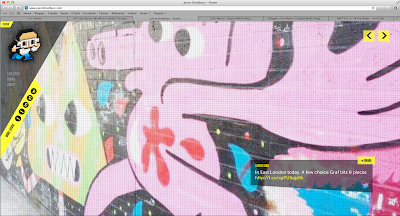
This website intrigued me by its responsive approach to it. When the page is resized the navigation elements are fixed to the page, they do not move at all. Its a strange and different website too as theres no navigation bar or footer. Its like a one page website with simple arrow buttons to navigation through pages which is unique and technically works well. I dont think it woud suit my website because it only suits this website because the pages are just massive images; so this sort of approach wouldnt suit a educational resource page with lots of text. 'http://www.jasonbradbury.com'
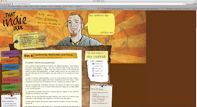
This website I have referred because I like the visual style. I think it is pleasing to the eye, I really like the brown colour scheme it has. For my visual style cause my theme is earthquakes, and it is a natural disaster I think a natural theme would suit my website. This means earthy colours such as browns would go well with the theme. I like the brown textures this indie dude website uses, I might use the same in mine. 'http://www.thatindiedude.com'
Here is another visual style I like. Its a very clean modern, techno/steel like theme. The blacks and greys look nice with the radial faded gradients across the page. It looks professional and the dark theme fits well with earthquakes due to earthquakes being considered 'bad' so black and bad or evil you could say fits together. The title of this website also sprung upon me. It looks really nice how it looks like it is imprinted on like steel, I have learnt to do this effect in a hand code lesson so this is definitely a concept and this theme of a whole to think about with my visual style. 'http://dragoninteractive.com'.
Here is a website I really admire and think looks amazing. I love everything about it. Starting with the colour scheme; I really like the browns with the texture they have on them. Especially down the bottom on the footer part of the page, and the gernal light brown cloth texture in the background of the mountains. It looks really nice and suits this whole website as a theme for the concept and visually how it looks with the page elements. The brown earthy colours suit the concept of this website of a organic tea drink. The browns are a natural organic colour. The like ridged edges around the box level elements really go well with the overall theme and colours, it looks natural by not having perfect square boxes. This is an idea I really like and probably will apply in my website. This whole website in general is definitely my biggest source of inspiration visually. 'http://www.truetea.cz/en/'
This is a really nice website which is enforced my decision of having the same visual style. I really like the white font they use in the header too, and the like low opacity title. I think it works really well and when I go on to do my post on fonts I will definitely be referring back to this website. Again the background colour to navigation colour is what I want in my website. The texture is very nice too which again is similar to what I want. One major point from this website which is now given me a headache is that the layout it has. My initial idea was having a black background with a brown wrapper containing everything on top. Now I am more drawn to having this technical layout. Have an invisible containing wrapper of text on top of just one massive background. I will do a post to explain my layout change.
Source: http://www.spoongraphics.co.uk


No comments:
Post a Comment