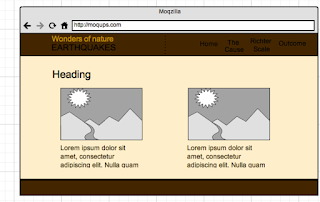
This will be a image slider which you can navigate between the images, each image will be a link to 'The cause', 'Richter Scale' & 'Outcome'
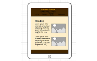
Homepage - Tablet portrait
The change here is that the nav drops below the header.
Homepage - Mobile
When it gets to mobile I shall have a drop down navigation represented by by a little arrow graphic.
The Cause & Richter Scale - Desktop/tablet landscape
My layout for these two tabs will be two column lay out. With text on the left and images on the right.
The cause is about how earthquakes are caused. It will be demonstrated by images of diagrams of the earth and its inside elements illustrating how it is done, with some text to support each diagram.
The Richter Scale page tells you how it is recorded, with an images and maybe video if i can get it in to support the text.
The cause & Richter Scale - Tablet portrait
My tablet portait lay out will be like this, text on top image on bottom. But this is not a concrete decision, it may be possible to have the same lay out as tablet landscape, it will depend how cramped it looks when ive actually made the page. So potentially this layout is a maybe.
The cause & Richter Scale - Mobile
For mobile Im having text above the image like this.
The outcome - Desktop & tablet landscape

My layout for the outcome page will be divided into two columns, into sections with an image and text below it displaying information on historic earthquakes of the twentieth outcome. It will show information such as number of people killed, measurement on the richter scale, date, location and number of casualties.
The outcome - Tablet portrait

My layout here will be different to the image above, instead of having text on the left and image on the right im going to either have the two column layout the same as desktop and tablet landscape unless it looks too cramped; again i will have to test it when im actually making it. If it is too cramped then i will make it into a one column layout with text below image again.
The outcome - Mobile
For mobile it will be one column layout, text above image again.


No comments:
Post a Comment